Tips & Tricks: The “Make Your Life Easier” Color Guide
Ok. If you never take heed of any of my tips but this one, that would be okay. (Not really, I give awesome tips, so you should definitely listen to them all….but this one is really, really helpful)
When starting a Pattern, any pattern, honestly, start with The “Make Your Life Easier” Color Guide. This is going to act as your Key to your fabric choices throughout the whole pattern. I usually stick it right to my wall, so that I can reference it every step of the way when working on my quilts. This way, when the pattern asks for Fabric 12, I can very quickly reference this chart and always know what I’m working with. As you can imagine, this is exceptionally helpful if you are working on a complicated pattern or a pattern that you’ve altered the fabric colors. This keeps you from getting confused and has gotten me out of trouble more times that I care to admit. You know that old adage, “Measure twice, cut once?” Consider this, “Set up your Color Guide Once and Reference it constantly to not mess up.”….okay, that doesn’t sound as smooth as I thought it would, but you get the point. lol
Shameless Plug: If you buy a pattern from me, I ALWAYS include one of these tailored to the pattern.
Here’s what you need:
Either a Blank Sheet of Paper or a Printout of The Bookerworx “Make Your Life Easier” Color Guide
A sharp pair or fabric scissors
Stapler with Staples or some straight or safety pins
A pen or marker or other writing implement
Your pattern
Here’s what you need to do:
Start by reading your pattern and making any adjustments on your pattern to reflect your fabric color choices. At the end of the day, you need to figure out what your Fabric A, Fabric B or Fabric 1, Fabric 2, etc are based on your pattern.
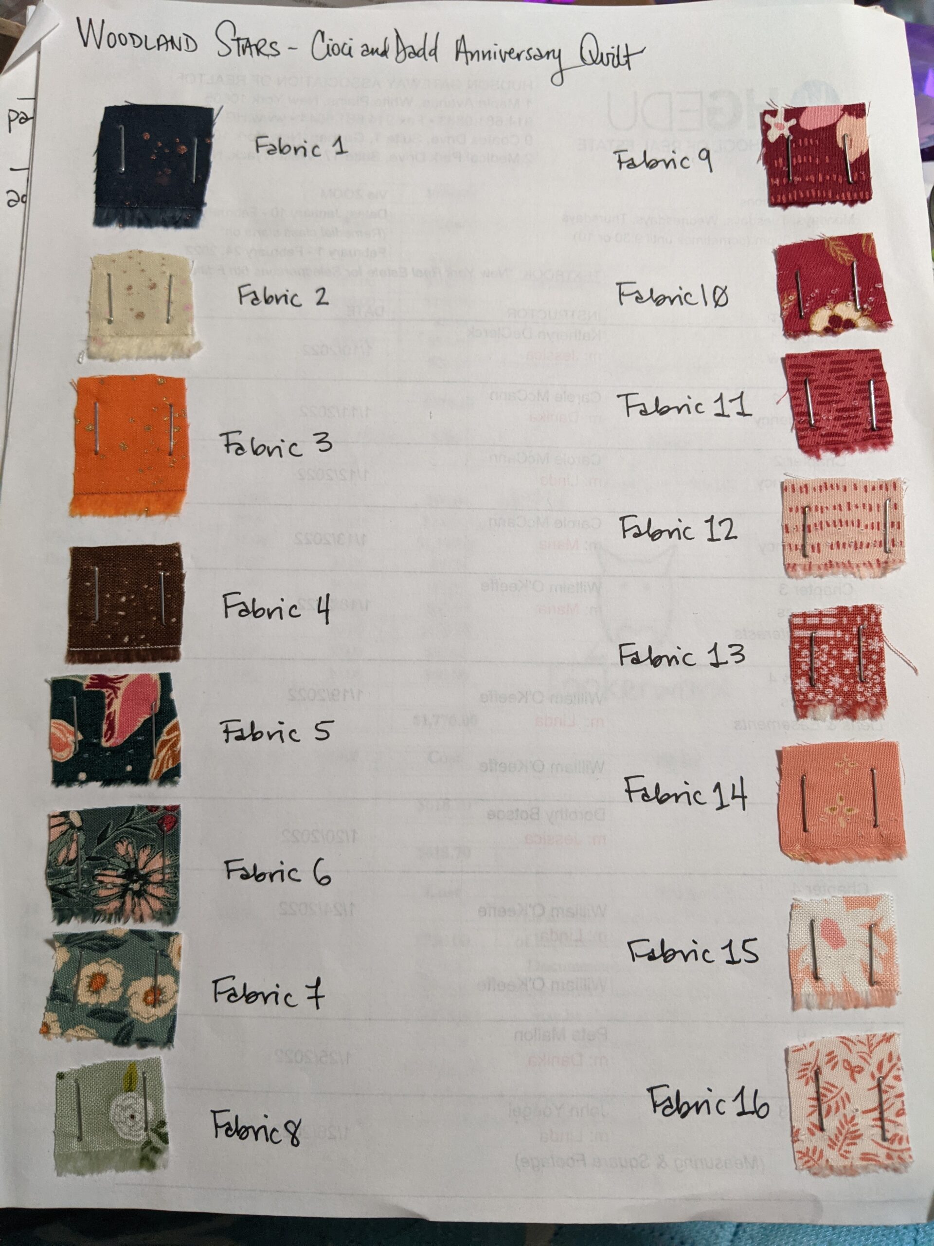
This Guide is especially helpful if you are adjusting a pattern to be different colors than originally designed. For instance, I’m working on a quilt right now that asked for three different sets of four fabrics to make trees in ombre. The original pattern calls for greens, mauves and blues, four fabrics each that grade from light to dark. I’m using the four fabrics for each tree, but instead of greens, mauves and blues, I’m using greens, reds and peaches.
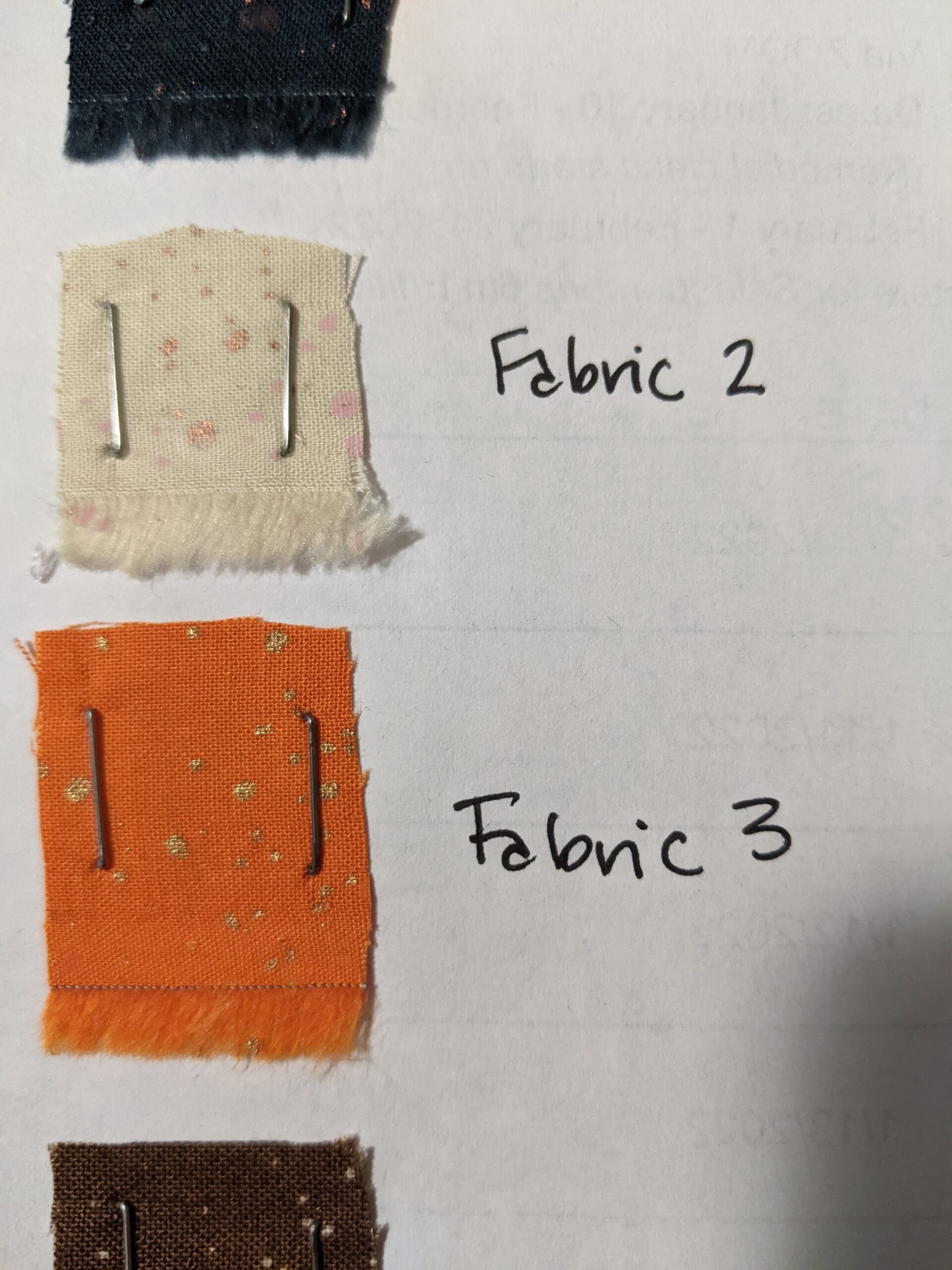
Figure out what your Fabric A or Fabric 1 is. You’ll want to name it based on whatever system your pattern uses. Using your fabric scissors, cut out a small corner of fabric from the edge. I try to always use the selvedge edge with the fuzzies (not the selvedge edge with the white strip) because that’s usually waste fabric because of the holes where the fabric sits on the loom. This is sort of unusable fabric anyway, so you aren’t taking away from your fabric size. I try to cut a square that’s about a half inch or 3/4 of an inch. You really don’t need more than that. It’s just enough so that at quick glimpse, you can identify the fabric quickly.
Using your stapler (or pins), attach your scrap neatly to your paper. Using the marker, label it “Fabric A” or “Fabric 1,”etc, based on what your Pattern calls for. I prefer staples, if possible, because there is a much lower risk of being randomly attacked by porcupine pins with staples. lol.
Now you are going to move to the next fabric and continue the process all the way down the sheet of paper. If necessary, start a new column on the outer right edge of the paper (you are only doing this so the stapler can reach).
Here’s a few examples of this technique from scratch.
This is the one I mentioned above, where I switched the colors around on the trees. This will make my life so much easier as I’m reading the pattern now. Whenever the pattern asks for me to cut Fabric 13 (or whatever fabric it asks for) I can just reference the sheet and move forward.
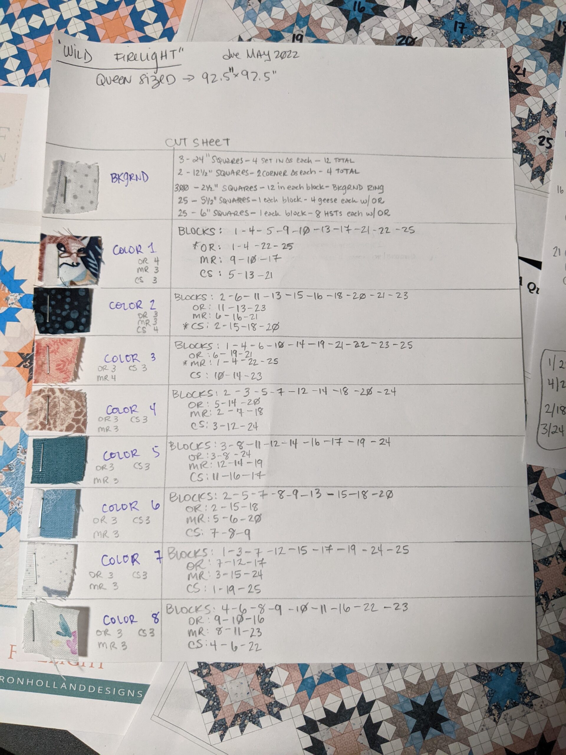
I named the first fabric “Background,” as that’s what the pattern called it. Remember, you are trying to make a key or a legend for the specific fabric you are using for the specific pattern you are using. The one below was then used as a cut sheet, so that I knew exactly what to cut from each color of fabric. As you can see, these Color Guides come in handy for multiple purposes.
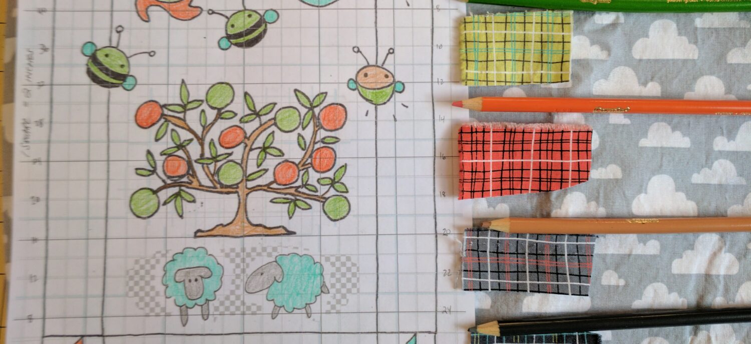
Here’s an example I made to create an Original Design for a Custom Order. This one shows you the fabrics, but also shows you which colored pencil the colors correspond to, so that the client could see how this would all shake out. Side note: This was one of the cutest designs, if I do say so myself.
I hope this Tip helps you out even a fraction of how much it’s helped me. I want to hear all about the Color Guides you are going to create now in the Comments! Good Luck and Happy Creating!!